I have written whole series related to Visual Studio 2012 features and this post will also be part of same series.You can get all my post related to visual studio from the following link.
Visual Studio 2012 feature series
Before some days I was searching something and found a great way to change the visual experience of visual studio 2012. I found that there are two type of themes available in visual studio 2012 light and dark under Tools->Option-> General environment value. This is one of newest feature I have found in visual studio 2012.

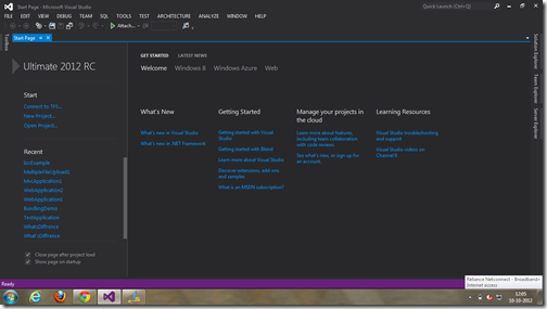
Once you switch to dark and click ok. It will look like completely dark like following.

It totally look like Expression blend and even if you open project the editor font and everything looks like same as blend.

I tried it for some days and now I loved it. It’s better for eyes. Hope you like it. Stay tuned for more updates.
Visual Studio 2012 feature series
Before some days I was searching something and found a great way to change the visual experience of visual studio 2012. I found that there are two type of themes available in visual studio 2012 light and dark under Tools->Option-> General environment value. This is one of newest feature I have found in visual studio 2012.

Once you switch to dark and click ok. It will look like completely dark like following.

It totally look like Expression blend and even if you open project the editor font and everything looks like same as blend.

I tried it for some days and now I loved it. It’s better for eyes. Hope you like it. Stay tuned for more updates.


0 comments:
Post a Comment
Your feedback is very important to me. Please provide your feedback via putting comments.